At a Glance

The Challenge
A brand worth
extending: carefully.
The Campground has earned some serious recognition across the industry. It's been published in Vogue, nominated for a James Beard Award, and it's become widely regarded as one of the best dining experiences in Kansas City. However, its digital presence just hadn't kept up with the restaurant's reputation.
The challenge wasn't reinvention. It was simply expansion: building upon a brand that feels unmistakably like The Campground, while opening the experience up to a wider, more accessible audience.
- Brand CoherenceThe extension had to feel distinct but clearly rooted in the original identity. The same funky, outdoorsy soul, just with an evolved expression.
- Accessibility FirstThe previous site created some friction. The new experience needed to work for everyone. Intuitive, legible, and inclusive design was a must.
- Illustration ContinuityThe restaurant already had founding illustrations with real character. My job was to blend in and elevate them, not override them.
The Website
Built to feel like you're
right at the table.
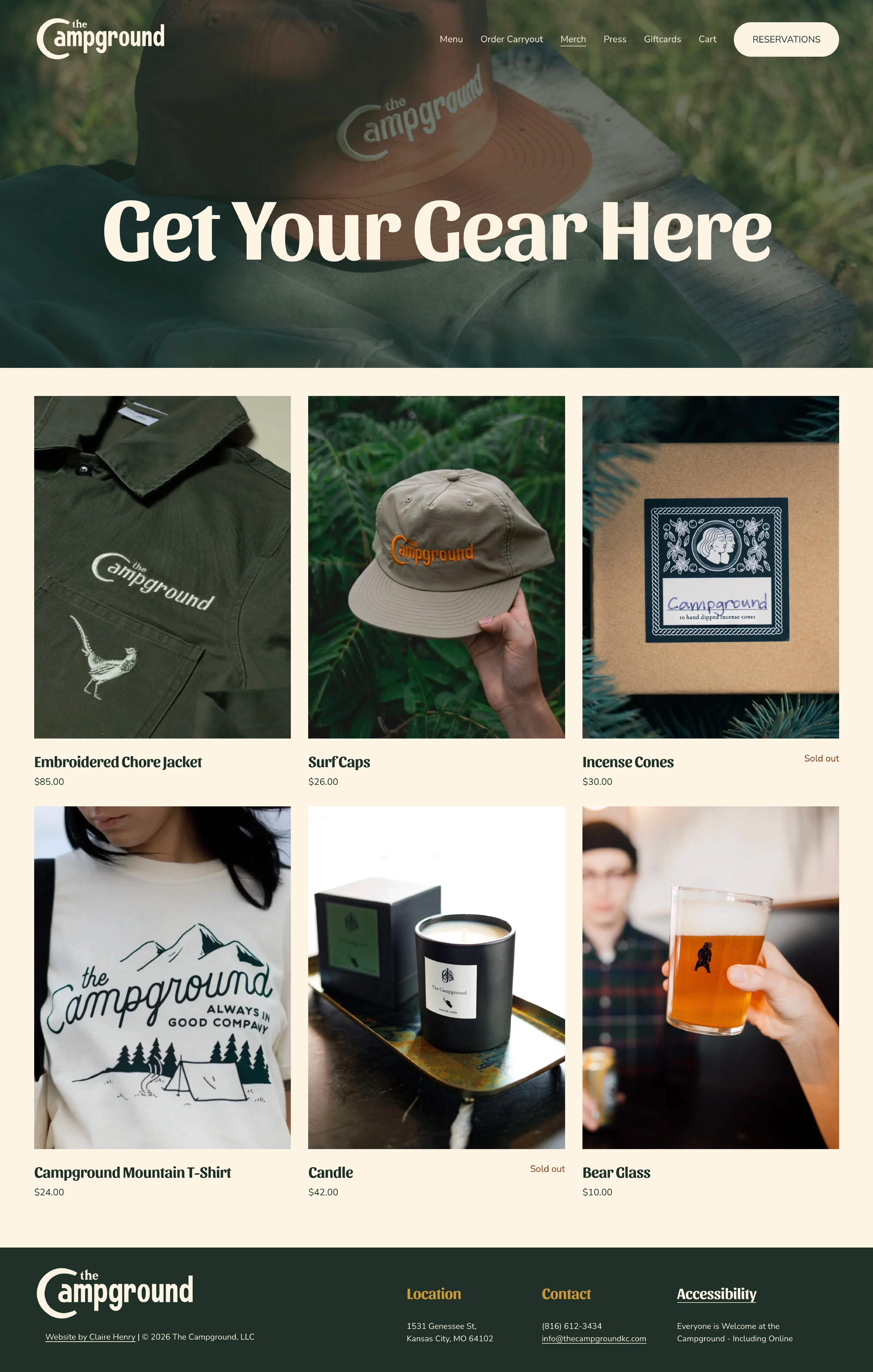
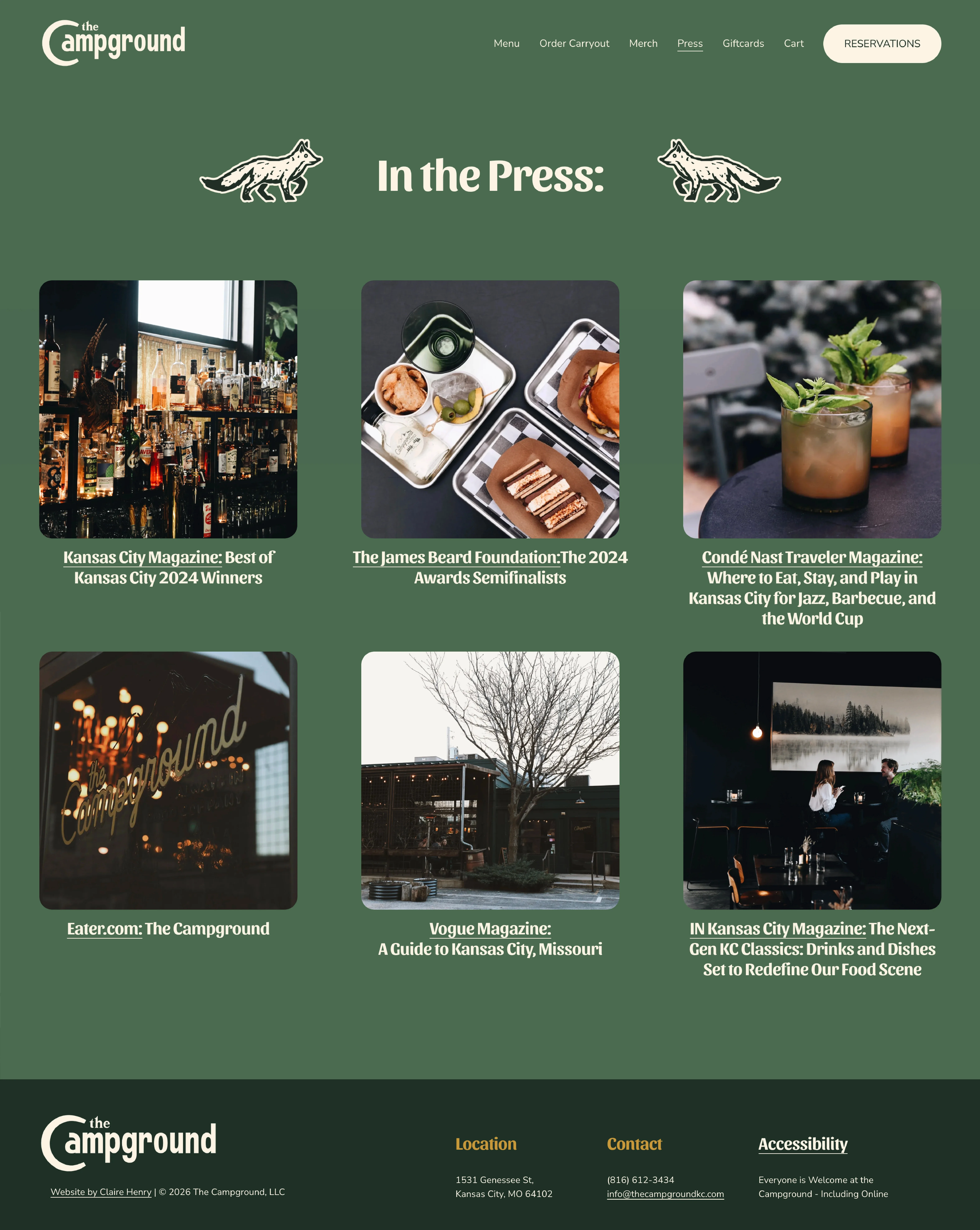
A fully accessible redesign with clear hierarchy, and a visual identity that matches the restaurant's reputation. The first thing you see on the homepage are the corner illustrations, recreated directly after the metal corner pieces embedded in the bar itself, tying the digital experience back to the physical space.
The Menu
A menu that's
exciting to read.
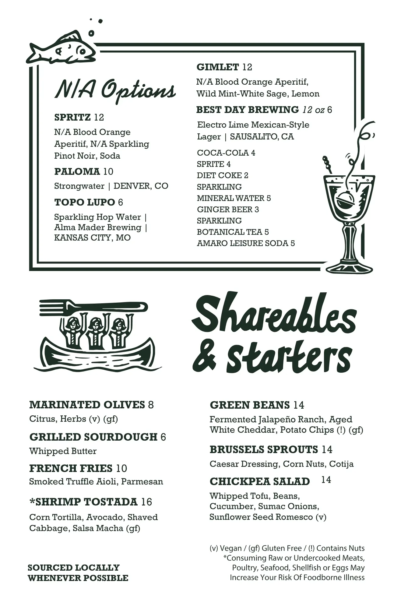
A 9-page menu designed at 5.5" × 8.5", built to be continually updated as the menu evolves.
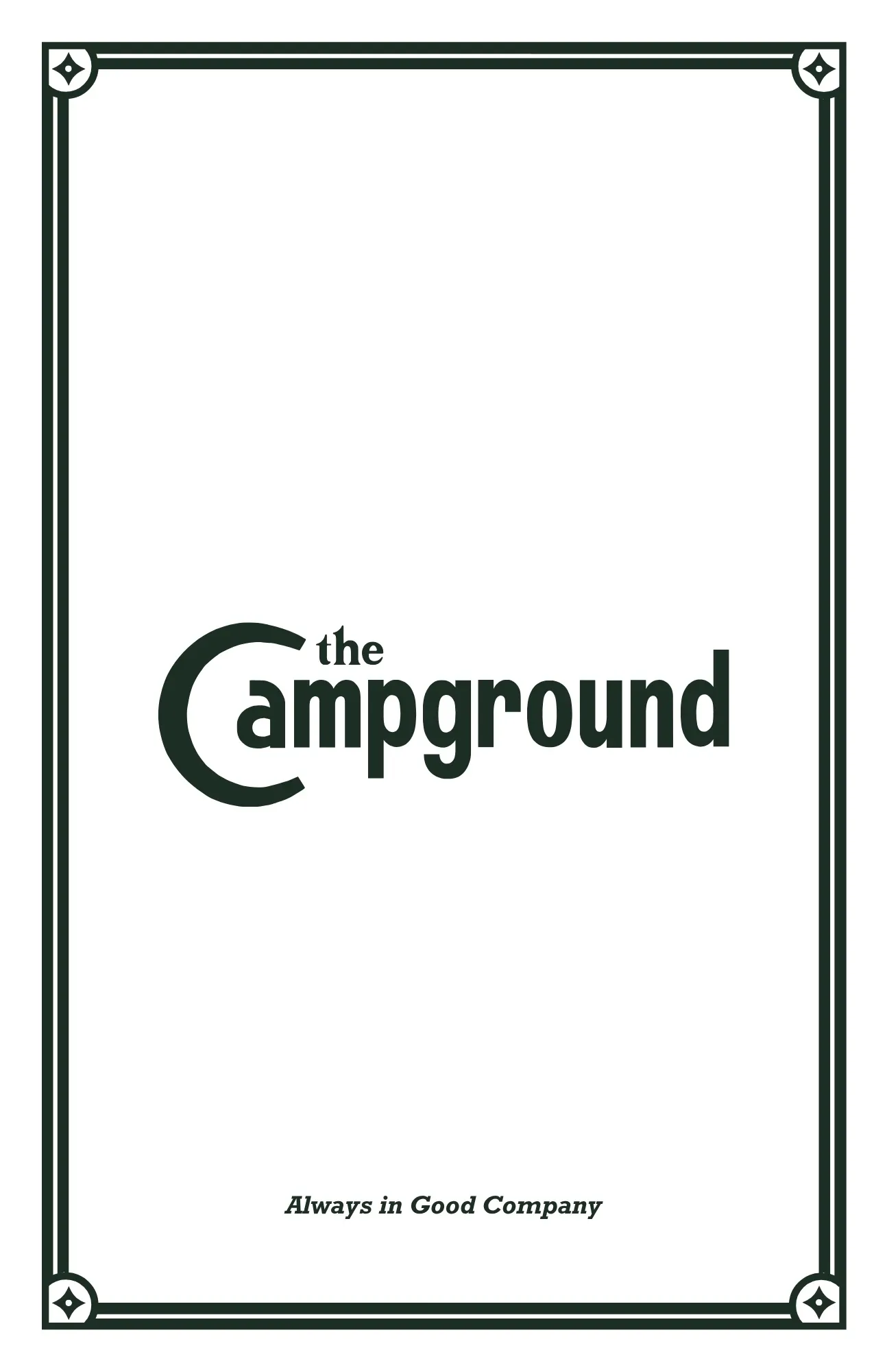
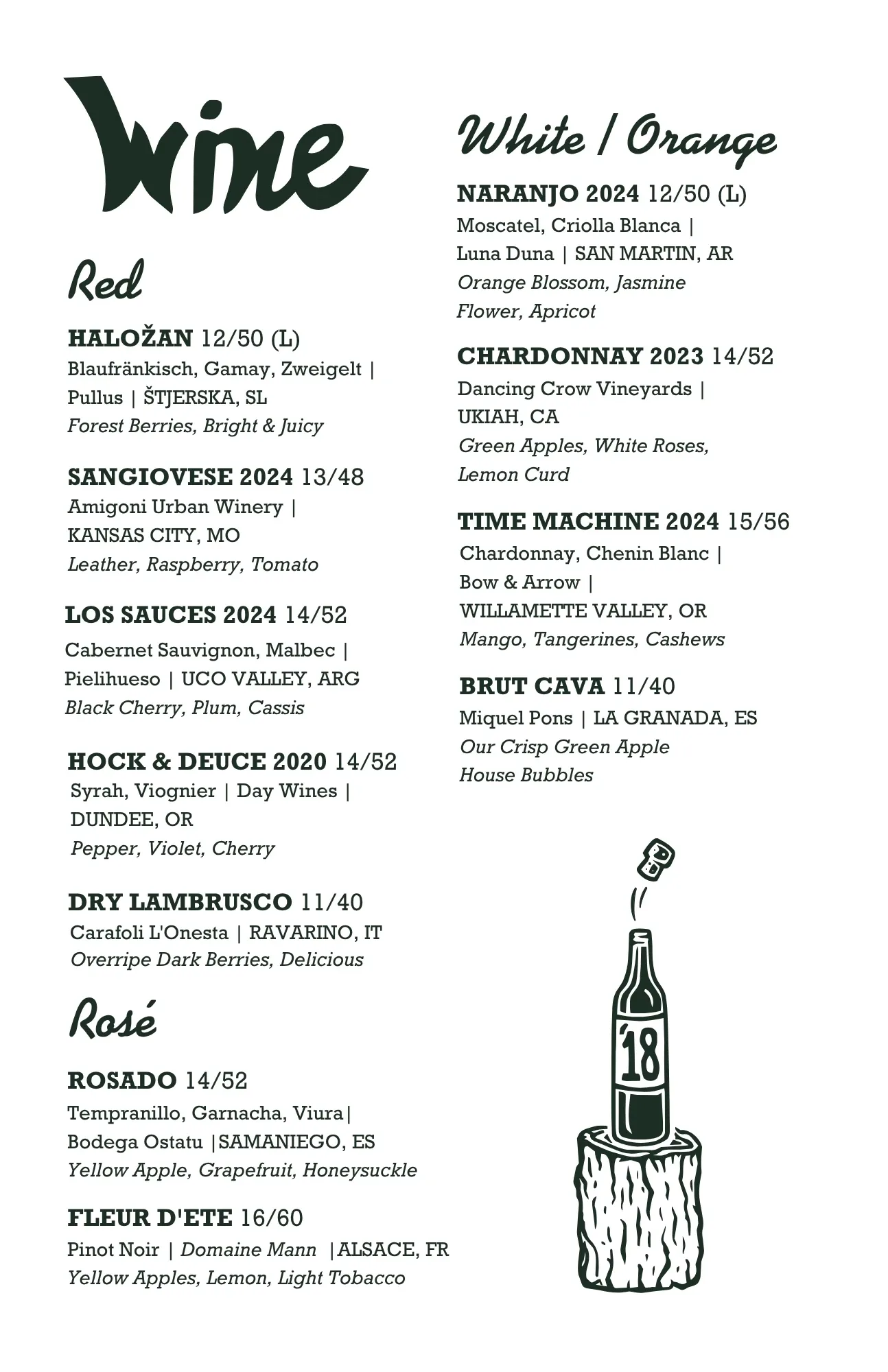
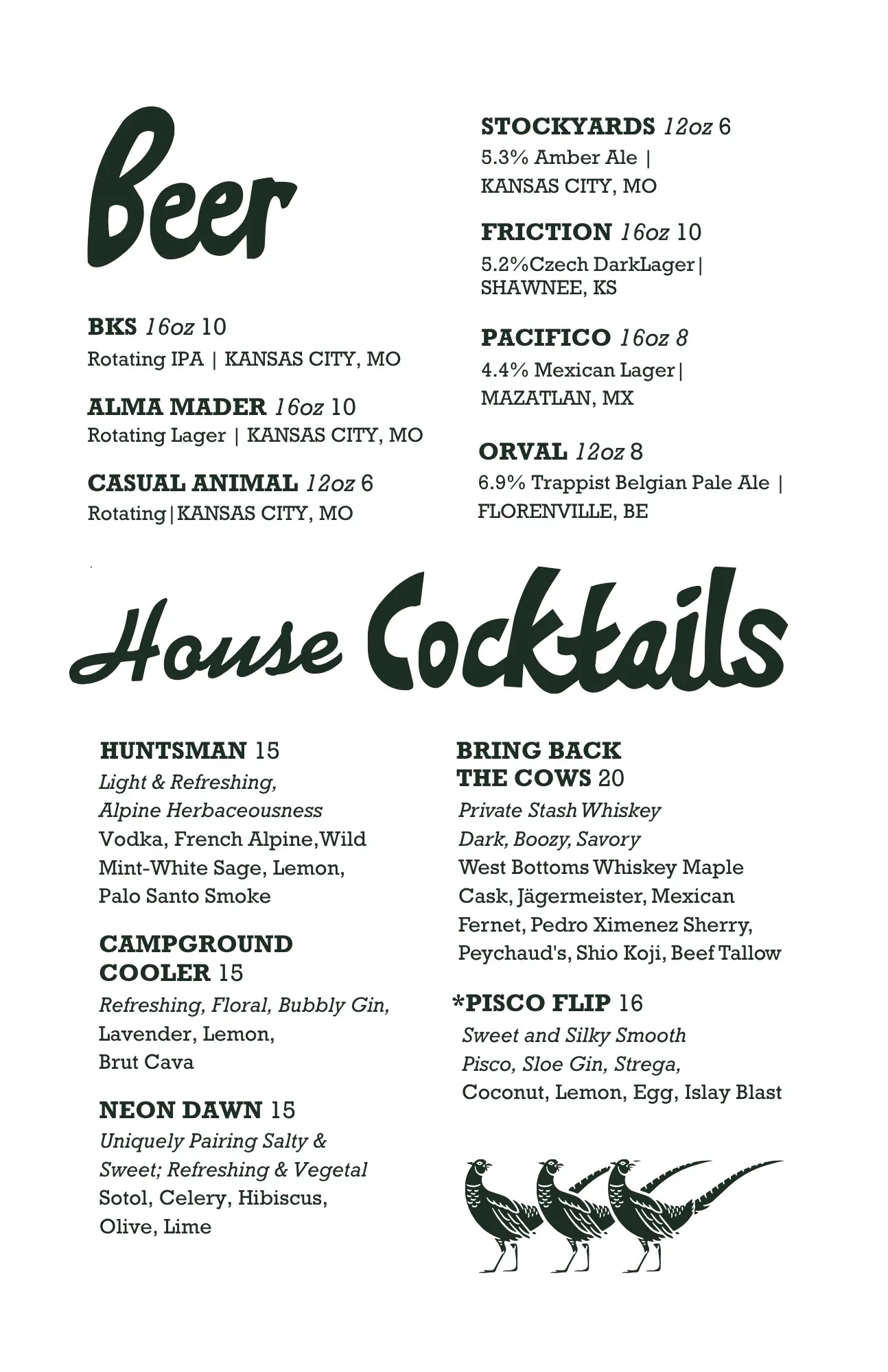
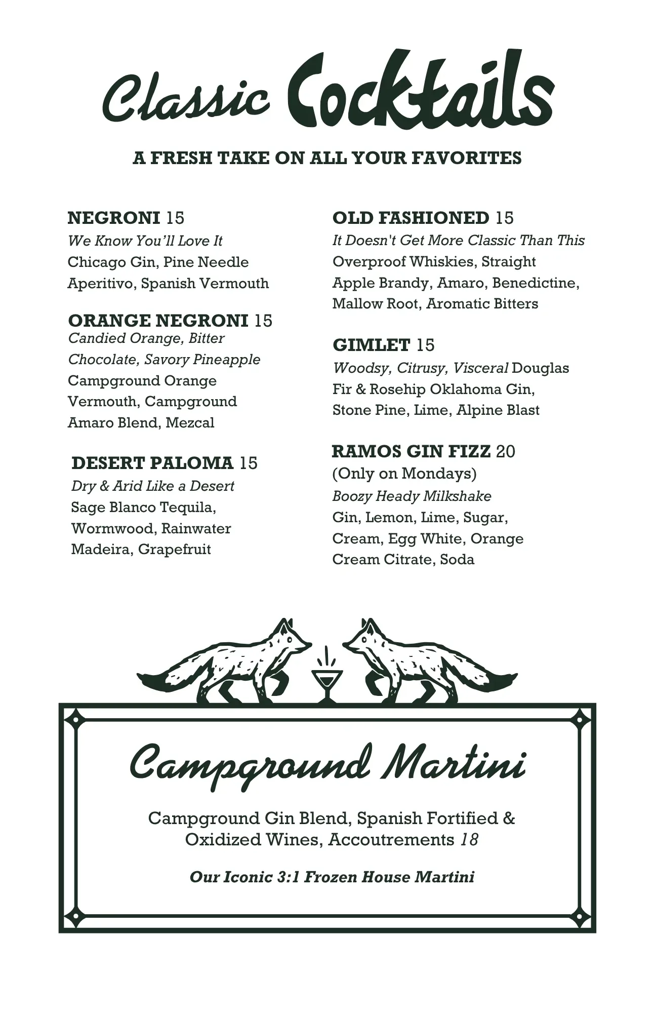
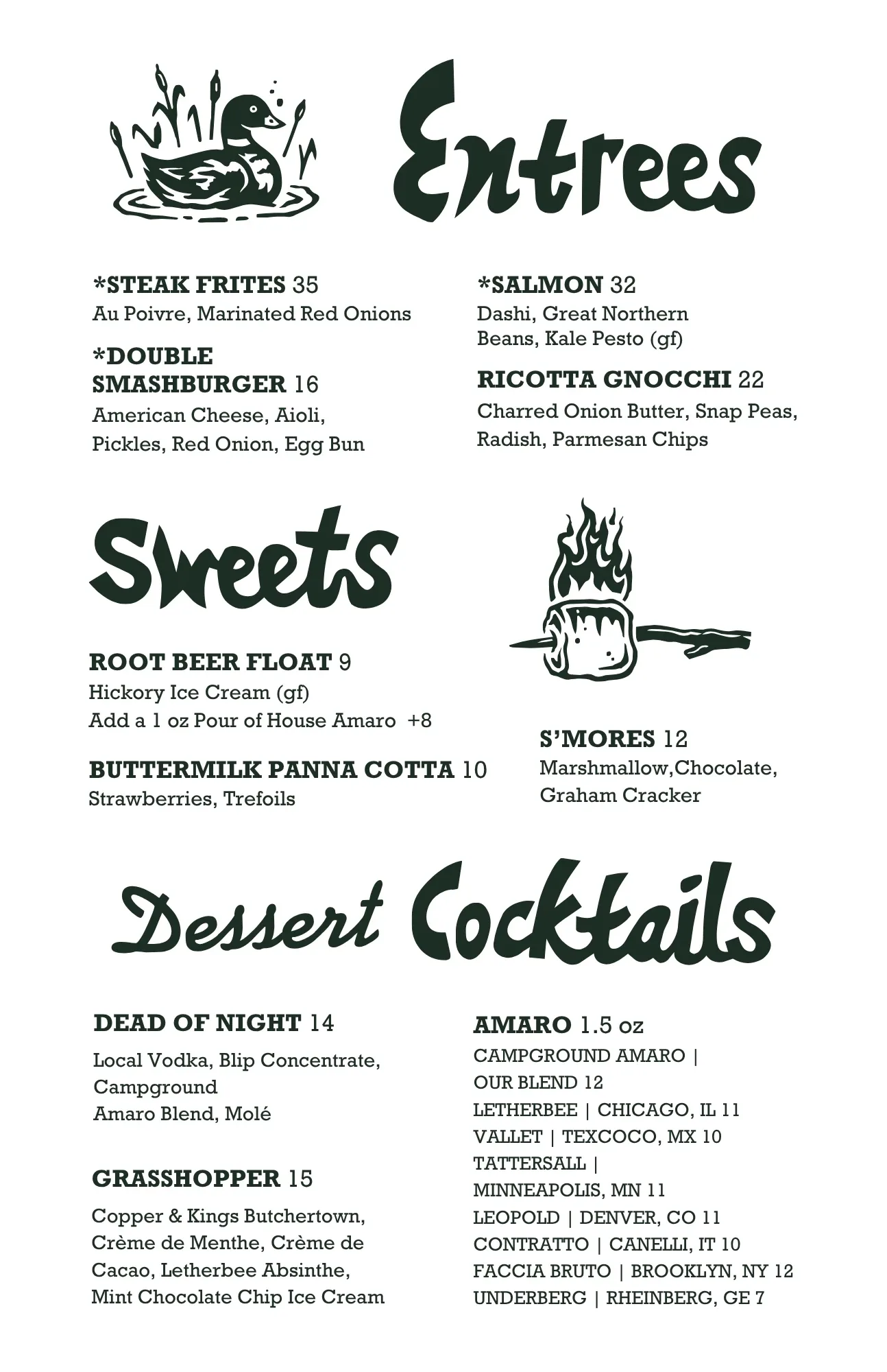
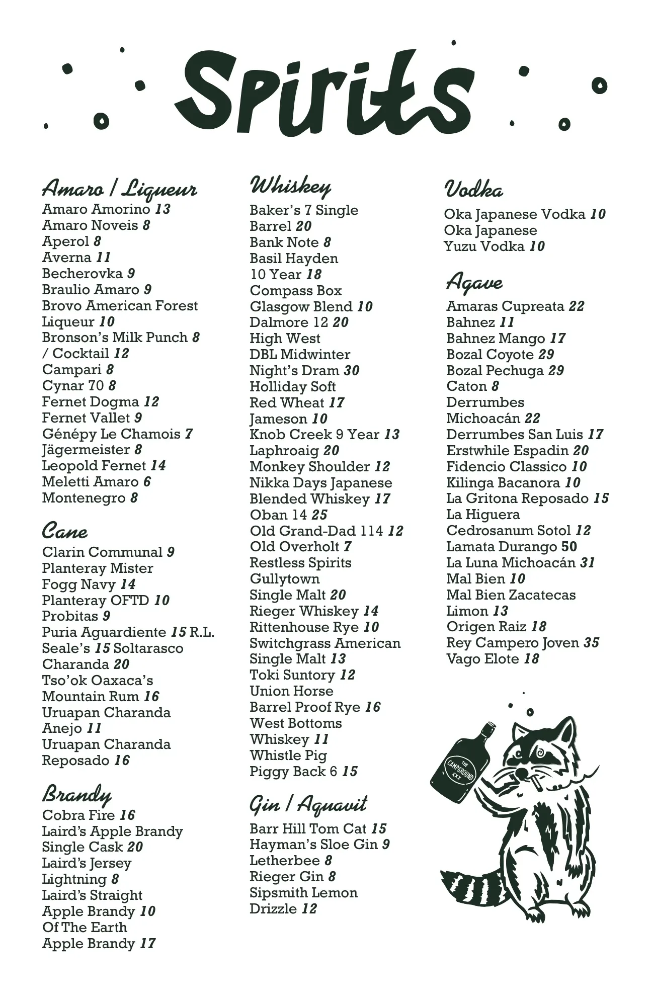
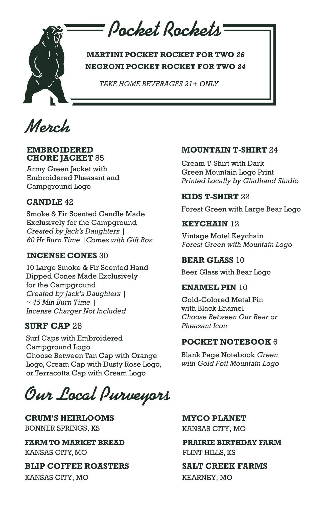
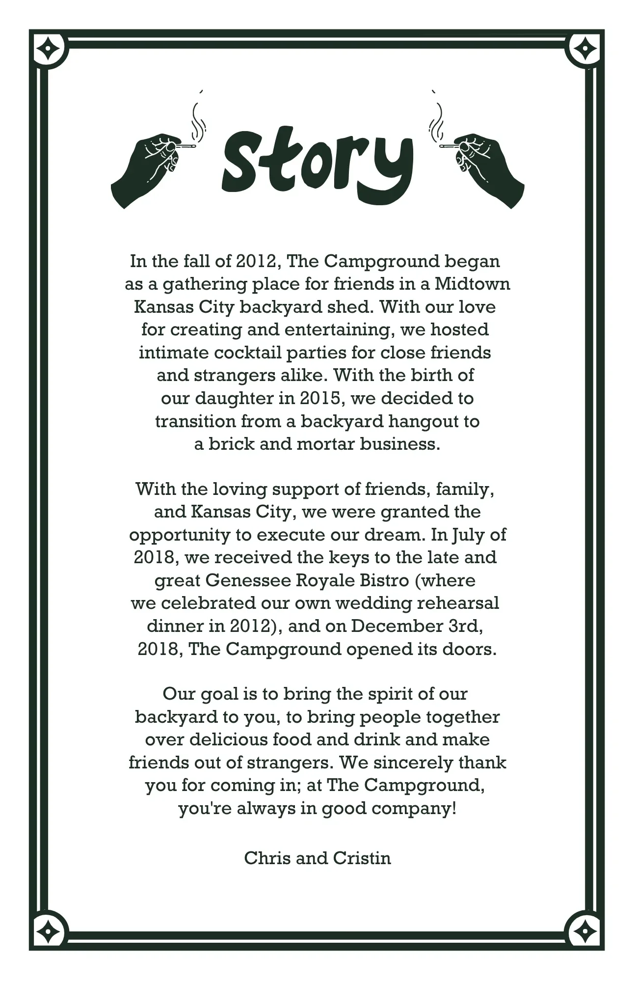
Illustration Suite
Drawn to blend in,
built to stand out.
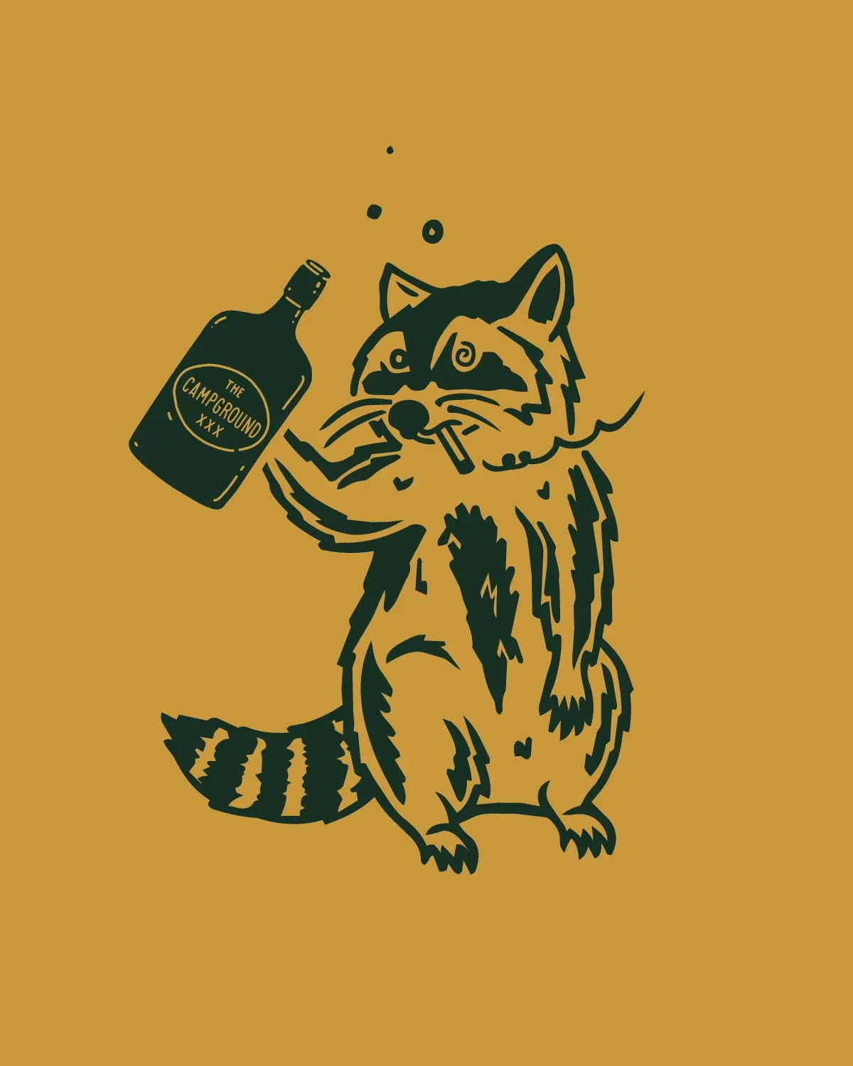
The Campground started as backyard cocktail parties at the founders' home — one of the best origin stories in the city. I created a new illustration suite designed to sit alongside their founding illustrations, so both could be used together in a new, elevated way.
The Outcome
A brand that pairs
with the meal.
The extended identity gave The Campground a visual system it could grow into, one that feels warm, grounded, and welcoming to new guests while honoring everything that made the restaurant special.